Scarlett Valencia Pulido
Editor-in-Chief
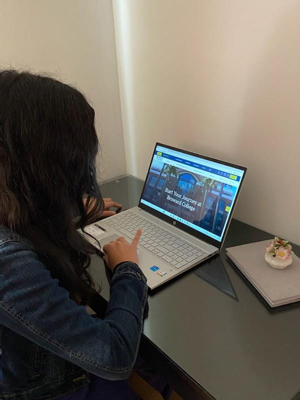
Say “Hello!” to Broward College’s website’s new look. Towards the end of last semester, many BC students began noticing a new design on the site. This new update brings a fresh appearance and new aspects worth checking out.
When you enter for the first time, you will see a pop-up that welcomes you to the “new” site, giving you a preview of what’s new.
Broward.edu went through a complete makeover in May 2020. Since then, they have implemented a continuous improvement model which consists of analyzing the website’s data to see how it is used, and its areas that can be improved or need fixes in order to act accordingly.
The project received incredible feedback from students, who, before release, described it as sleek, modern, and easier to navigate than before.
Some of the new features include a Notification Center, represented by a bell icon, that displays pertinent information for students. Some messages found here may regard FAFSA form availability, scholarships, and registration deadlines.
The re-design as well as the continuous updates are made by a joint effort between BC’s Creative Director, Jennifer Silverio, and IT’s Web Support Services department, overseen by Maria Perez-Del Valle. Daniela Circonciso, AVP of Marketing, and Bryan Anderson, AVP of Enrollment Management also collaborated on the newest redesign.
Improving the prospective student user flows as well as the user interface (UI) and expanding the design system were the main goals during the development of this project.
“Over the past two years, we found some areas of the site were not performing the way they should and knew we would need to streamline the home page to make sure the site goals were being met,” mentioned Silverio.
When you enter any website for the first time you want to be able to look through the homepage and easily navigate to a specific area you want to go to. The new design enhances the user’s experience and guides them to what they are looking for. With the previous interface, it would take a while to find valuable information and the search bar was the go-to for many students.
Rose D. Julien, a Pre-Pharmacy student, shares that the website is more approachable now. “It’s easier to navigate because it is clear and highlights essential sections.”
The updated drop-down menus were expanded to give users one-click access to areas frequently visited like Student Resources, Financial Aid, and Registration.
Silverio points out that content presented in the previous version of the website directed visitors to many things simultaneously, making the site look and feel overwhelming and confusing to users.
Now we see a bold and welcoming home page showcasing BC’s diverse community, culture, and opportunities.
This page also does a great job presenting the academic degrees offered and what they entail. If you click on one of them, you reach a detailed description about them and slide down to reach a list of the specific programs available.
“The new home page has a very clear flow down the page, with points along the way which allows for users who are prepared to take action or for those who are still in an exploratory mindset to keep going,” Silverio commented.
There were also improvements made to the career outlook thanks to the integration of Career Coach. Here you can find out about jobs, learn about a career’s prospects, or even take a quiz to see which career path is meant for you depending on your educational goals.
Among the newest features aimed at prospective students is the “See Yourself Here” section, located near the bottom of the home page. Where you can check out BC’s social media accounts, hover over images to learn more about the college, and envision your journey at Broward College.
The backend of the website went through some modifications as well for the customizable left-hand navigation support, the expansion of the icons library, and the integrations of new views for the card grids, which Silverio explains to be the “building blocks” making up the website.
But Silverio explains that a website project never truly reaches a completion state. “It’s important to keep in mind that a design system is never really ‘done’; it will grow and evolve just like any other product,” she said.
We can surely expect new improvements that continue to put users first in the future. But for now, explore the new site and discover the ways in which you can utilize it to enhance your experience at Broward College.

